ART WORK
George 10/03/12
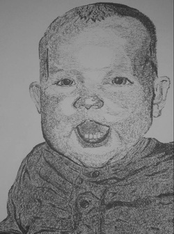
For this project we had to do a scribble drawing. We created a grid on our paper and used that to make sure our drawing was proportional. I did a portrait drawing of my younger brother, George. We also had to pick out values to draw and later shade with our pens. I used a sharpie pen to complete this drawing and the entire portrait was done in a random scribble pattern. I'm very happy with they way it turned out. The scribbles add great texture to the portrait and it looks a lot like the original picture, so I'm very pleased with this piece.
Colors of the Abstract 10/05/12
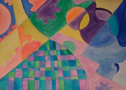
To start out with this project we had to draw abstract lines and shapes on our paper. Then our teacher instructed us on the different techniques for painting with water color. I used several different techniques to create this piece, like dry-brushing, painting with a wet brush, and wetting the paper before applying the paint to sample the many styles of watercolor. We were then instructed to block off different sections of our paper. In each of those sections we painted a different color pattern from the color-wheel. I used monochromatic, complementary, primary, secondary, warm, cool, and analogous colors; one in each section of my painting. I am pleased with the way this piece turned out. It wasn't particularly creative, but I did manage to keep the watercolors from blending and I like how neat it is. It was also the first piece of abstract art I created.
GlObAl WaRmInG 11/08/12
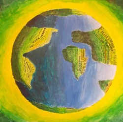
To create this project we had to pick a world issue and then an object to represent that issue. I chose to do my painting on Global Warming and used the world to represent it. We had to cut and paste text from magazine articles and newspapers to create value on over 1/2 of our object. The text had to relate to our issue and we used different words, based on font size and style to help create value. We also used acrylic paint to add color and value to our paintings following an analogous color scheme, which is 3-5 colors next to each other on the color wheel. I chose to use the colors yellow, yellow-green, green, blue-green, and blue, as you can see from my painting. By using these colors I was able to create a cool mood because Global Warming isn't a positive issue. However, I added some bright yellow and yellow-green because I believe there is hope for the future and I think my painting represents that. I am very happy with the way this piece turned out.
A Hallway in Perspective 11/26/12
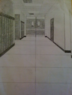
The purpose of this project was to improve our perspective drawing skills. For this project we had to sit in the hallway with a pencil and a ruler and then recreate the hallway using 2-point perspective drawing techniques. I drew one of the hallways in our school and if you went on a little scavenger hunt, you could probably find this specific hallway. We used various techniques in our drawings to make them seem more realistic, like vanishing points and horizon lines. We also used shading to get rid of the lines in our drawings to make them seem more realistic. I used pencil to add shading to my drawing. While this project taught us valuable techniques in 2-point perspective drawing, I didn't really enjoy the subject matter very much. I found it very challenging to make all the lines as straight as possible and then get rid of those lines with shading. I also didn't like using pencil to shade this drawing. Since it was so large everything seemed to blend together and I couldn't seem to get wide variety of values. I'm satisfied with the way this drawing turned out, but I don't think I would choose to draw something like it again.
A Tiny Dancer 12/19/12
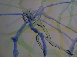
This was a fun mini project we created. First, we had to pick three analogous colors from the color wheel. Then we dripped and poured the watered-down paint on our paper to create organic shapes. We also had the option to splatter our paint but I choose not to. Once the paint dried we had to examine our paintings and see what shapes or objects we could pull out. I found a distorted ballerina dancer in mine. We were then instructed to add value to our paintings using pen, to make our objects stand out. I'm very happy with the way this painting turned out. I had a lot of fun creating this project and I think it would be a lot of fun to do it again on a larger scale.
New York City Skyline 1/02/13
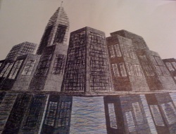
For this project we were instructed to draw a scene with at least five buildings using 2 or 3 point perspective drawing. I choose to use 3 point perspective for my drawing. The scene I choose to capture was that of the New York City skyline. I got a chance to visit New York last year and it was an unforgettable experience; so I choose to use what I saw there as inspiration for this drawing. First, I mapped everything out in pencil, making sure all the lines were in alignment with my vanishing points. Then I added value to my drawing with sharpie. I also added a hint of color to the water to put the emphasis on it. I purposely left the shading messy to give it more of the loose, free feeling I felt when I was in New York. I'm satisfied with how this drawing turned out and I hope to create more artwork like this one in the future.
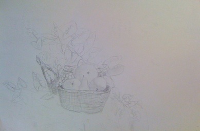
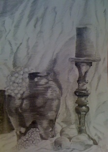
Still Life 1/16/13
|
|
These are my projects from our still life unit. Drawing things from "still life" means drawing an object in front of you, exactly how it is. For this unit our teacher would arrange a variety of objects on a table and then have us learn different techniques to draw them. The piece on the left is the first drawing I did in the still life unit. I had not learned any tips or techniques at this point, but I did this drawing to have something to compare my later drawings too. The next couple weeks we spent learning how to do a quick-gesture sketch, couture drawing, sight measure based off the tips of our pencils, and how to compare and contrast the size of the objects we were drawing. We also learned how to pull out value to add depth to our drawings. Every technique and tip we learned helped to make our drawing more life like and more realistic. Both of my drawings here are done in pencil, even though we sampled with charcoal in this unit too. This piece on the right was my final drawing after I learned many new tips from my teacher. I am very, very pleased with the way this drawing turned out because I've never drawn anythings so realistic before. I'm definitely going to use the tips I learned to create more artwork in the future.
A Word of Wisdom: Graphic Style 2/04/13
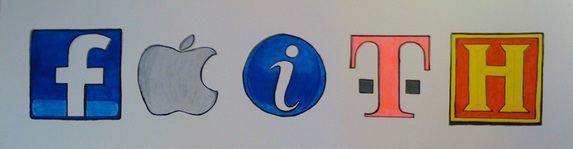
For this project we first had to pick a word we found inspirational. I picked the word FAITH. Faith means a lot to me. I'm a Christian and my faith is definitely a huge part of my life. It defines who I am, what I stand for, and what I believe in. I also picked this word because it inspires me and I think it inspires others. Why do we live life? Out of FAITH, that someday there's going to be something more, something we can't fully understand, but can only wait for with eager anticipation. Our faith is something we hold deep inside of us and it's something no one can strip away; there's power behind this word and that's why I picked it. To create this piece I first had to find icons that would spell out my word. I choose the icons from Facebook, Apple, Intel, T-Mobile, and the History Channel. I then sketched the icons out in pencil on a grid. Then I gave the icons a bold finish with bright markers to give it a very graphic feel. This was a quick, fun project to do, and I'm happy with the way it turned out.
Dove Love 2/26/13
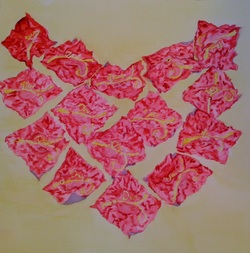
Our assignment for this project was to paint candy wrappers. So I got to bring a bag of Dark Chocolate Dove Candies and eat them in class so I could paint the wrappers. That was a lot of fun and very tasty too. After eating the chocolate I arranged the wrappers in a heart shape. Then I sketched out the candy wrappers with pencil, paying close attention to the detail in the wrappers and the labeling. I then added color to my piece with watercolor. I used various shades of red to show the shadows and creases in the wrappers, and I used yellow in the background to accent the labels and color the background. This project was very tedious to do but I'm pretty happy with the way it turned out. I don't mind using watercolor but I found it kind of boring to paint candy wrappers.
Scratch-board Lion 3/05/13
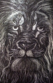
This was a quick little project we did to get our minds thinking in the opposite way, to carve away material to show detail and value, instead of adding ink or pencil to our projects. For this project I first did a sketch in pencil of lion. I made sure to include lots of detail in the fur of the lion. Then I transferred my sketch on to the scratch-board with a pen. I then had to scratch away all the light highlights with a thumb tack, to expose the white paper underneath the black paint. It was a little irritating to finish this project because I could only scratch away one small line at a time. However I'm pretty pleased with this project, but I don't think I'll choose to do something like this again. I'd prefer to paint or draw.
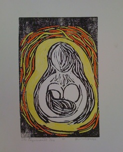
La Madonna 3/22/13
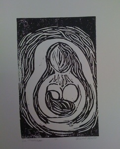
La Madonna |
The Unquenchable Fire |
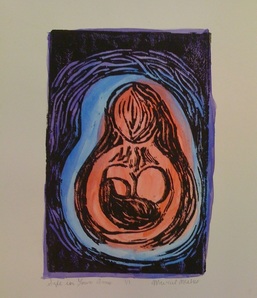
Safe In Your Arms |
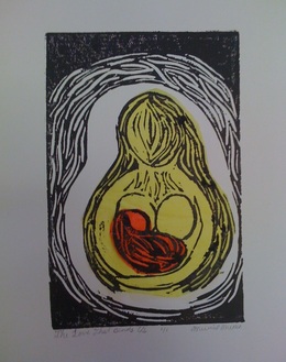
The Love That Binds Us |
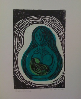
Green Goddess |
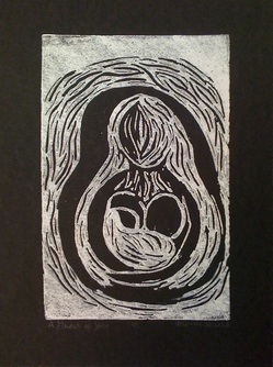
A Ghost of You |
This was a long term project we did through the process of Printmaking. First, we created a design and craved it into a linoleum tile, using various tools. I had to use a variety of tools to pull out the light values in my design. I did several artist proofs to test out my plate before I was finished with it. Then we inked up our plates and printed our designs on nice paper. The fun thing about print making is that you can print as many copies of your design as you want, if you like it. The first print we did was plain black ink on white paper. I titled that print La Madonna, which is also the overall title for my project. The next print I printed with black ink and white paper and then added colored pencil highlight it. I titled this print The Unquenchable Fire. For the next print I did a wash of red, blue, and purple using water color, before I printed on top of it with black ink. I titled this print Safe In Your Arms. For another print I added colored tissue paper to highlight the mother and her child before printing on top of it. I titled this print The Love That Binds Us. For this next print I got to choose two mediums to add to my print. I added tissue paper, printed on top of it, and then added colored pencil to the back ground. I titled this print Green Goddess. For the last print I printed with white ink on black paper. I titled this print Ghost of You. I'm very pleased with how this project turned out. I really like the prints with tissue paper and with the water color wash. I'd definitely like to do more Printmaking in the future.
